How to optimize images for your website in 4 steps
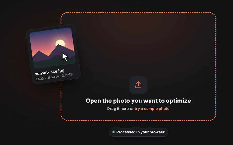
Upload your photo
Drag the image onto the upload area or try the sample photo. It's processed in your browser and isn't sent to any server.
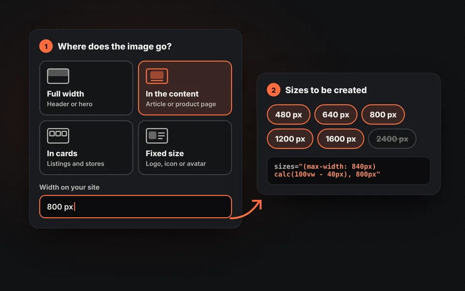
Tell us where it goes
Tell us whether it spans the full width, sits inside an article or goes in a card. With that we calculate the sizes you need and the sizes attribute.
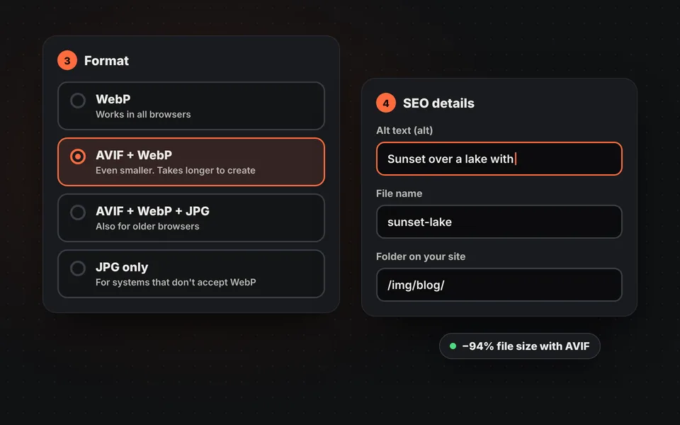
Choose the formats
WebP so it works in every browser, or AVIF plus WebP for even smaller files. Also enter the alt text and your website's folder.
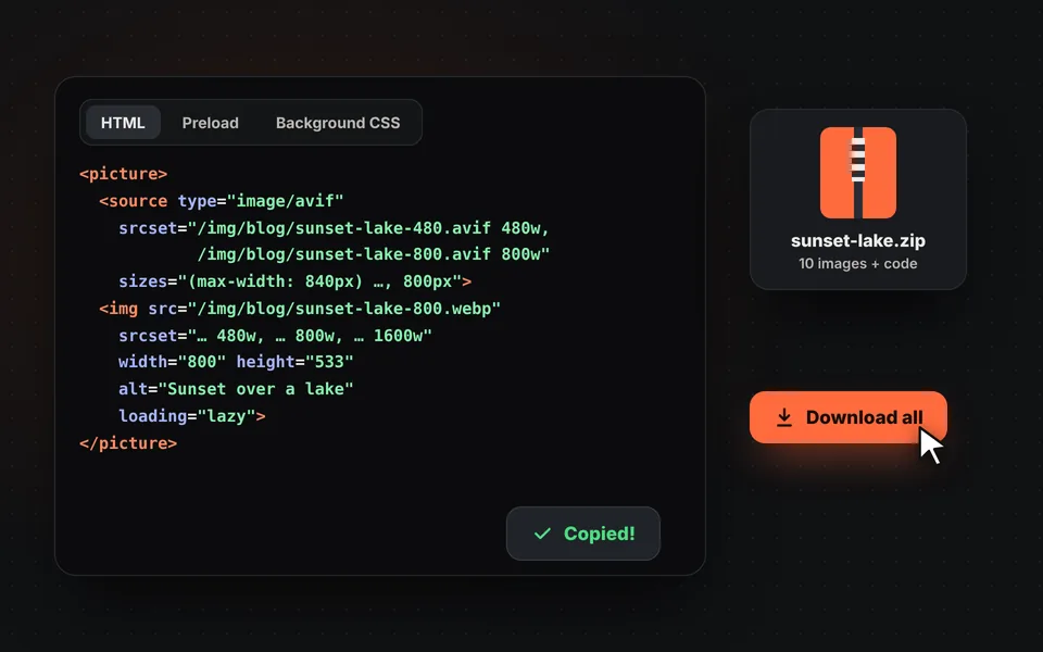
Copy the code and download
Check in the simulator which size each screen downloads, copy the HTML code and download all the images in a ZIP.
Video tutorial: how to optimize images for the web
In this video you'll see how a 1.6 MB photo is uploaded, how to say where it goes on the website, how to choose the aspect ratio, sizes, format and quality, how to fill in the alt text and file name, how to check which image each screen downloads and how to copy the HTML code and download the ZIP. Click a chapter to jump straight to that part.
The video only loads from YouTube when you press play, and YouTube may then set its cookies. More information in the cookie policy.
What does optimizing an image for the web mean?
Optimizing an image isn't just making it smaller. It's making sure each visitor downloads the right version for their screen: a 640-pixel photo on a phone, a 1920-pixel one on a large monitor, and always in the lightest format their browser understands.
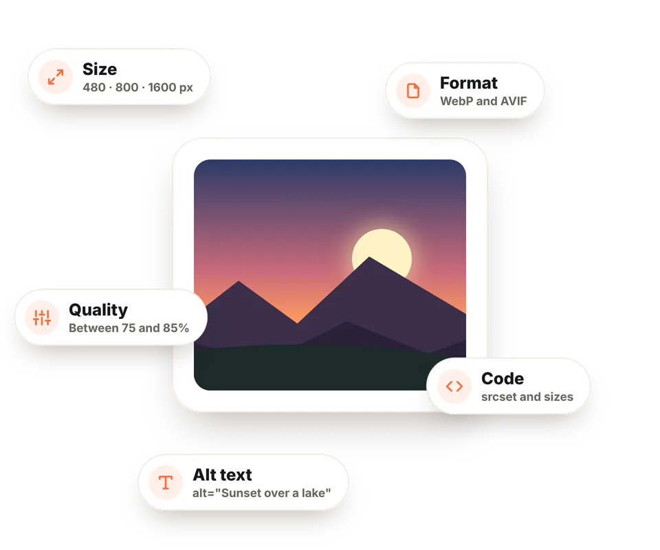
That takes five things: the right pixel size, a modern format like WebP or AVIF, well-tuned quality, the correct HTML code (srcset, sizes, width and height) and good alt text. This tool prepares it all at once.
If you only need one of those tasks, there are also separate tools to compress images, resize them or convert to WebP.
Responsive images: srcset and sizes explained
With srcset you give the browser a list of versions of the same image and the width of each. With sizes you tell it how much of the screen it will take up. With those two pieces of information, the browser does the math and picks the smallest version that will look sharp, also taking into account whether the screen is high resolution.
<img src="/img/sunset-1280.webp"
     srcset="/img/sunset-640.webp 640w,
             /img/sunset-1280.webp 1280w,
             /img/sunset-1920.webp 1920w"
     sizes="(max-width: 840px) calc(100vw - 40px), 800px"
     width="1280" height="853" alt="Sunset over a lake with mountains"
     loading="lazy" decoding="async">
In this example, a 390-pixel phone with a 3x screen needs about 1050 real pixels and will download the 1280 one. A regular laptop, where the image takes up 800 pixels, will also download the 1280 one, while a Retina laptop will request the 1920 one. Writing sizes by hand is the hardest part; here it's calculated automatically from where the image goes.
WebP, AVIF or JPG?
| Format | Size vs. JPG* | Browsers | When to use it |
|---|---|---|---|
| WebP | 25% to 35% smaller | All current ones | The default choice for any website. |
| AVIF | Up to 50% smaller | Current ones; not old ones | To squeeze the size, always with WebP or JPG as a fallback. |
| JPG | Reference | All, including old ones | As a fallback or in systems that don't accept WebP. |
| PNG | Much larger | All | Logos, icons or images with transparency and few colors. |
* At similar visual quality. It depends on each photo.
The main image and LCP
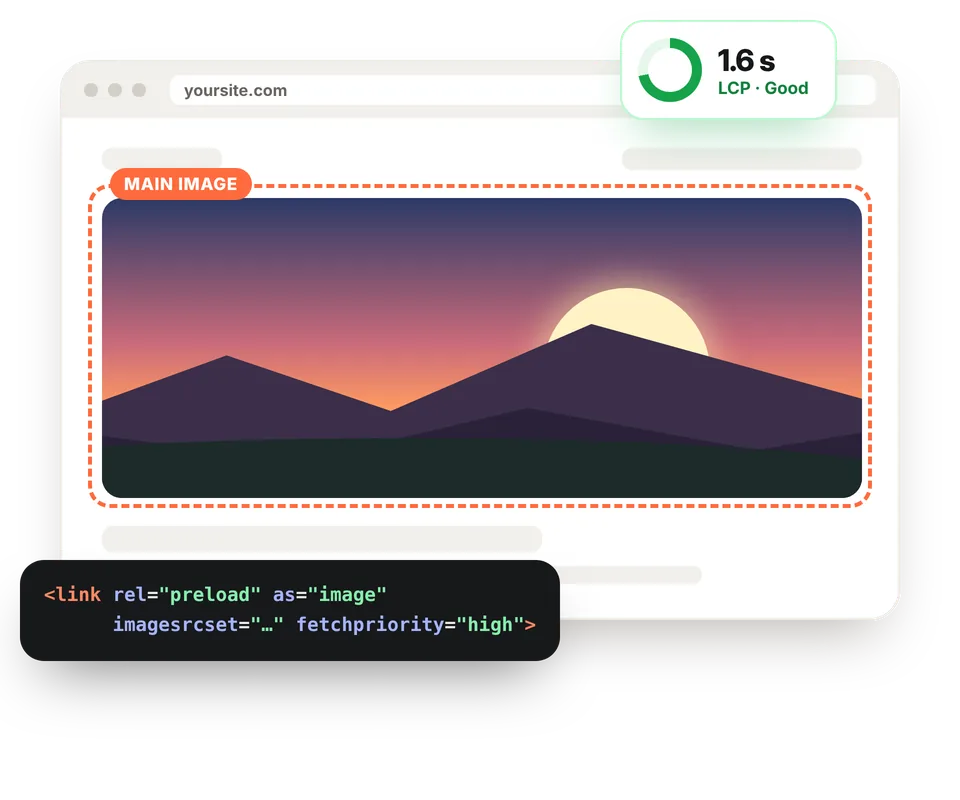
LCP (Largest Contentful Paint) measures how long the largest element on the screen takes to appear when a page opens, which is almost always an image. It's one of Google's Core Web Vitals, and it should stay under 2.5 seconds.
For that image, the code changes: it shouldn't have loading="lazy", it's worth adding fetchpriority="high" and, even better, a <link rel="preload"> tag in the <head> so the browser starts downloading it before anything else. Tick "This is the main image of the page" and the tool will give you both.
Common mistakes when adding images to a website
Uploading the photo straight from the camera
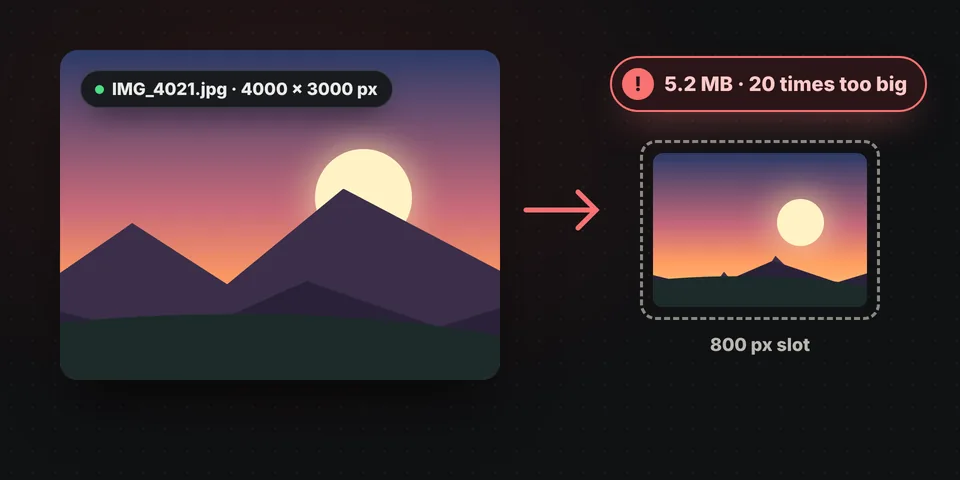
A 4000-pixel, 5 MB photo in an 800-pixel slot forces visitors to download 20 times more than needed.
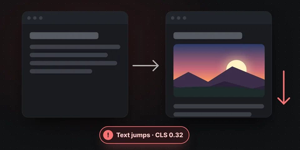
Leaving out width and height
Without them, the text jumps down when the image finishes loading. That worsens CLS and annoys readers.
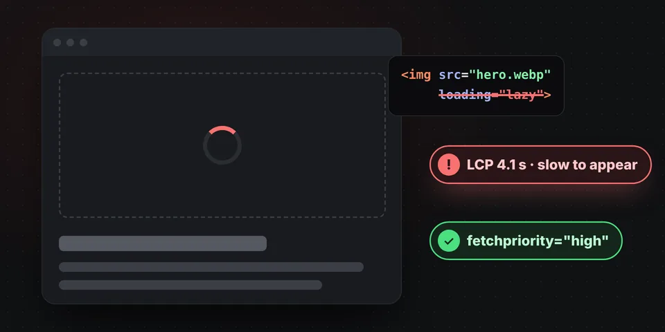
Lazy loading the main image
With loading="lazy", the image you see when opening the page takes longer to appear and LCP gets worse.
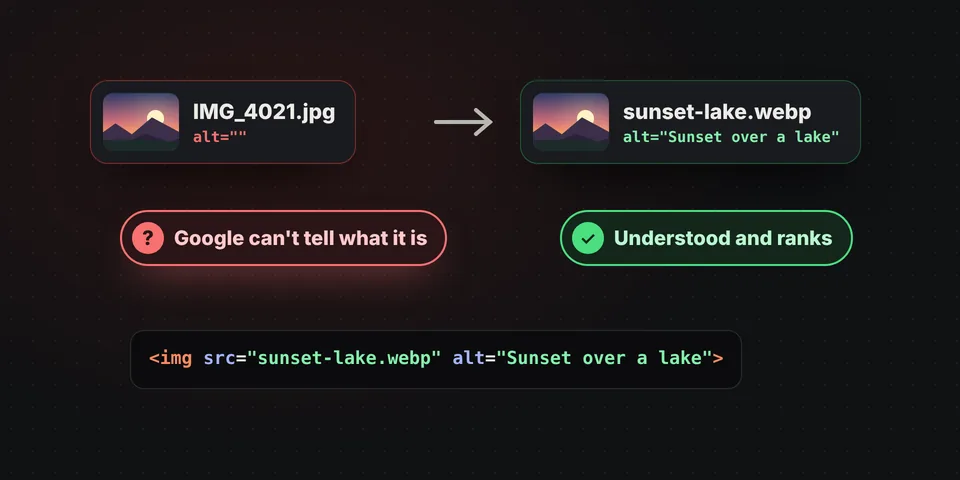
Names like IMG_4021.jpg and an empty alt
Google understands an image called sunset-lake.webp with alt text describing it much better.
What if I use WordPress or another CMS?
WordPress automatically creates several sizes of the images you upload to the media library and adds their srcset. Even so, it's worth uploading the photo at a reasonable size and with a good name. This tool is especially useful when you write the HTML yourself: templates and themes, custom pages, landing pages, static websites, Shopify, HTML emails or any project where you have to prepare images by hand.
If you then want to touch up a photo, you can open it in our online image editor without leaving this page using the "Edit" button.
Frequently asked questions
What does optimizing an image for the web mean?
It means preparing it to look good and load fast: with the right pixel size for each screen, in a modern format like WebP or AVIF, with a small file size and with the correct HTML code (srcset, sizes, width, height, alt and lazy loading).
How is it different from compressing an image?
Compressing only reduces a file's size. Optimizing for the web goes further: it creates several versions at different sizes, chooses the format and gives you the code so each screen downloads only the one it needs. If you just want to shrink some photos, use the compress images tool.
What is srcset and what is it for?
It's an attribute of the img tag that gives the browser a list of versions of the same image with their width. Together with sizes, which says how much of the screen the image takes up, the browser picks the smallest one that will look sharp. That way a phone doesn't download the photo meant for a monitor.
Which format is best for the web: WebP, AVIF or JPG?
WebP is the safest choice: it's considerably smaller than JPG and works in all current browsers. AVIF is even smaller but takes longer to create; ideally use it with WebP as a fallback inside a picture tag. You only need JPG for compatibility with very old browsers.
How many sizes of an image do I need?
It depends on where it goes. A full-width image needs more versions, from about 480 up to 1920 or 2560 pixels. An image inside an article is usually fine with its width, double that for high-resolution screens and one or two sizes for phones. The tool calculates them for you.
Are my photos uploaded to a server?
No. The images are created in your browser, even the AVIF ones, and never leave your computer. You can check by disconnecting from the internet with the page open.
Why should I add width and height to images?
So the browser reserves space for the image before downloading it and the page doesn't jump around while loading. Those jumps worsen CLS, one of the Core Web Vitals that Google takes into account.
Should I use loading="lazy" on every image?
On all of them except the main image visible as soon as the page opens. That one should load as soon as possible, with fetchpriority="high" and, if you like, a preload tag. Tick the "This is the main image" box and the code will come out ready.
Does it work for WordPress?
WordPress already creates several sizes of the images you upload to the media library. This tool is useful for everything else: templates, custom pages, landing pages, hand-coded websites, Shopify or anywhere you write the HTML.
Why does it take longer with AVIF?
Creating AVIF files requires many more calculations than WebP or JPG, and here it's done on your own computer. With a large photo it can take a few seconds per size. In return, the images are considerably smaller.
Is it free?
Yes: free, no sign-up, no watermark and no usage limit.